> ## Documentation Index
> Fetch the complete documentation index at: https://docs.smashandclash.in/llms.txt
> Use this file to discover all available pages before exploring further.
# Design system
> smashandclash.design: the official look of Smash&Clash as a .design file your agent can follow - as it is, or with your own flavour.
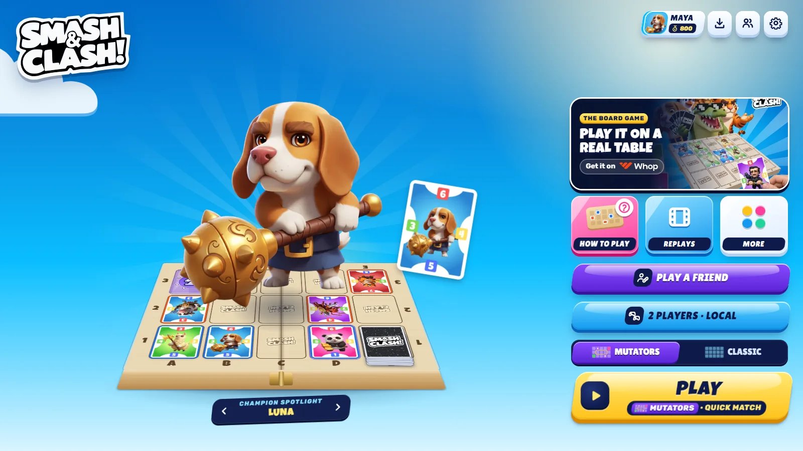
Smash\&Clash's look - tilted candy buttons with a hard lip on a bright blue world, sticker titles, one sun-yellow action per screen - is published as a [`.design`](https://github.com/AgentsORG/DESIGN) file: a design contract written for coding agents. Put it in your project, and your agent builds a client that feels like Smash\&Clash.
Colours, type, shapes, motion, sound, components, voice and the rules - design.v1.
The same tokens as CSS variables (`--sc-*`), generated from the file.
## Use it with your agent
1. Save the file at the root of your client's project:
```bash theme={null}
curl -o smashandclash.design https://www.smashandclash.in/smashandclash.design
```
2. Give your agent the skills that read it and set the craft bar:
```bash theme={null}
npx skills add AgentsORG/DESIGN # the design skill: reads and follows .design files
npx skills add AgentsORG/design-engineering # the design-engineering skill: motion, polish, accessibility
```
We recommend [design-engineering](https://github.com/AgentsORG/design-engineering) for any client you build: it covers what a design file leaves to judgment - motion and easing, interaction polish, accessibility and copy.
3. Ask for UI as usual ("build the lobby", "draw a card in my hand"). The agent loads `smashandclash.design` first and builds from its tokens and components. The file carries its own instructions, so an agent without the skills still follows it.
The file pairs with the [card art, animation and sound](/build/overview) from the SDK: it says how the game looks, and the kit gives you the art and audio.
## What's in it
| Section | Holds |
| - | - |
| `intent`, `overview` | The look in a sentence: a press-able toy on a sky-blue world |
| `tokens.color` | The world blue, navy ink, sugar surfaces, the seven candy fills, you / them, Mutators / Classic, card frame and value-badge colours |
| `tokens.typography` | Luckiest Guy (titles, card values), Lilita One (labels, names), Rubik (text) |
| `tokens.radius`, `shape`, `elevation` | Corner radii, the -8° tilt, the hard lip under every candy |
| `tokens.motion`, `sound` | Durations, easings and springs; the candy-pop sound family |
| `components` | Button (seven fills), hero button, icon button, tile, tabs, segmented, switch, toast, dialog, ribbon, screen header, player plate, game card, card back, board tile |
| `decisions`, `constraints` | Which fill when, how to colour players, what never to do |
| `voice` | How Smash\&Clash talks: short, upbeat, names over labels |
| `themes` | Arena Pop Blue (the default) and the game's high-contrast mode |
## Your own flavour
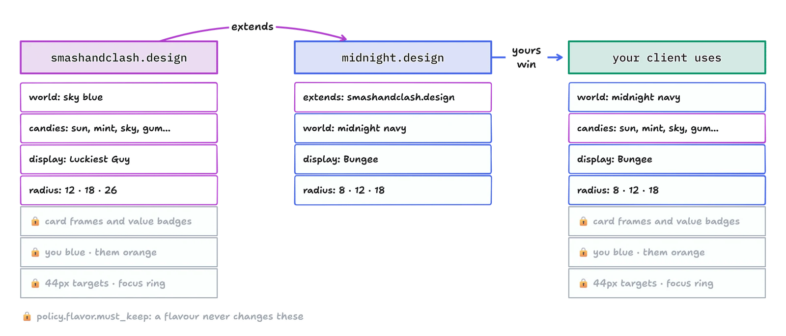
The default is Smash\&Clash. To give your client its own look, don't edit the file - extend it. Create your own file next to it and override only what you want to change:
```yaml midnight.design theme={null}
schema: design.v1
name: midnight-arena
version: 0.1.0
extends:
- ./smashandclash.design
description: "Smash&Clash at night - my client's flavour"
agent:
skill: design
instructions: |
You are holding a .design file (design.v1) that extends smashandclash.design.
READ: load smashandclash.design first, then apply this file on top (this file wins, path by path).
FOLLOW: build UI from the merged tokens and components; keep everything listed in
smashandclash.design policy.flavor.must_keep exactly as it is.
UPDATE: edit this file, never the base; bump version.
VERIFY: compare the merged tokens with your CSS and report drift before fixing it.
PRECEDENCE: user prompt > this file > smashandclash.design > design skill > model defaults.
intent:
reference: "Smash&Clash's arena after dark: the same candy, under neon"
tokens:
color:
world: { deep: "#0b1030", mid: "#141c4f", bright: "#24308a", pale: "#5966c9", mist: "#c9d0ff" }
background:
world: "radial-gradient(130% 110% at 50% 0%, #24308a 0%, #0b1030 80%)"
typography:
display: { fontFamily: ["Bungee", "Luckiest Guy", "system-ui", "sans-serif"] }
radius: { sm: 8, md: 12, lg: 18, xl: 24 }
```
`policy.flavor` in the file lists what you may change and what you keep:
| You may change | You keep |
| - | - |
| The world colour and backgrounds | The seven card frame colours (power tiles match them) |
| The candy fills, surfaces and ink | The four value-badge colours |
| The display, label and body faces | Blue for you, orange for them |
| Corner radii, the tilt, the lip | The card art, card back and their 825:1125 proportions |
| Motion and the sound material | 44px targets, a visible focus ring, AA contrast, reduced motion |
| Your voice's register | No "CPU" labels; no easy / medium / hard |
What you keep carries game meaning or keeps players safe. Change the frame colours and a power tile no longer says which cards it boosts; change you and them and a player reads the board wrong.
## Use the CSS variables
`smashandclash.tokens.css` holds every token as a CSS variable. A candy sets its three colours, and the shared rules draw it:
```html theme={null}
```
The `high-contrast` mode applies under `:root[data-theme="high-contrast"]`.
## What to avoid
* **Two suns on one screen.** Cancel next to Play is sugar.
* **Easy / Medium / Hard.** The opponent adapts to the player's rating; there is no difficulty picker.
* **"CPU".** Every opponent has a name.
* **A stand-in card back.** A star or a blue rectangle is not the card back; use the real one.
* **White text on sun, mint, sky or gum.** Those take navy ink.
The art, audio and characters are free to use in clients built for Smash\&Clash; they stay Smash\&Clash's. See [Using the art and audio](/build/overview#using-the-art-and-audio).
This documentation is built and hosted on [Mintlify](https://mintlify.com), a developer documentation platform.
 ```yaml midnight.design theme={null}
schema: design.v1
name: midnight-arena
version: 0.1.0
extends:
- ./smashandclash.design
description: "Smash&Clash at night - my client's flavour"
agent:
skill: design
instructions: |
You are holding a .design file (design.v1) that extends smashandclash.design.
READ: load smashandclash.design first, then apply this file on top (this file wins, path by path).
FOLLOW: build UI from the merged tokens and components; keep everything listed in
smashandclash.design policy.flavor.must_keep exactly as it is.
UPDATE: edit this file, never the base; bump version.
VERIFY: compare the merged tokens with your CSS and report drift before fixing it.
PRECEDENCE: user prompt > this file > smashandclash.design > design skill > model defaults.
intent:
reference: "Smash&Clash's arena after dark: the same candy, under neon"
tokens:
color:
world: { deep: "#0b1030", mid: "#141c4f", bright: "#24308a", pale: "#5966c9", mist: "#c9d0ff" }
background:
world: "radial-gradient(130% 110% at 50% 0%, #24308a 0%, #0b1030 80%)"
typography:
display: { fontFamily: ["Bungee", "Luckiest Guy", "system-ui", "sans-serif"] }
radius: { sm: 8, md: 12, lg: 18, xl: 24 }
```
`policy.flavor` in the file lists what you may change and what you keep:
| You may change | You keep |
| - | - |
| The world colour and backgrounds | The seven card frame colours (power tiles match them) |
| The candy fills, surfaces and ink | The four value-badge colours |
| The display, label and body faces | Blue for you, orange for them |
| Corner radii, the tilt, the lip | The card art, card back and their 825:1125 proportions |
| Motion and the sound material | 44px targets, a visible focus ring, AA contrast, reduced motion |
| Your voice's register | No "CPU" labels; no easy / medium / hard |
What you keep carries game meaning or keeps players safe. Change the frame colours and a power tile no longer says which cards it boosts; change you and them and a player reads the board wrong.
## Use the CSS variables
`smashandclash.tokens.css` holds every token as a CSS variable. A candy sets its three colours, and the shared rules draw it:
```html theme={null}
```
The `high-contrast` mode applies under `:root[data-theme="high-contrast"]`.
## What to avoid
* **Two suns on one screen.** Cancel next to Play is sugar.
* **Easy / Medium / Hard.** The opponent adapts to the player's rating; there is no difficulty picker.
* **"CPU".** Every opponent has a name.
* **A stand-in card back.** A star or a blue rectangle is not the card back; use the real one.
* **White text on sun, mint, sky or gum.** Those take navy ink.
The art, audio and characters are free to use in clients built for Smash\&Clash; they stay Smash\&Clash's. See [Using the art and audio](/build/overview#using-the-art-and-audio).
This documentation is built and hosted on [Mintlify](https://mintlify.com), a developer documentation platform.
```yaml midnight.design theme={null}
schema: design.v1
name: midnight-arena
version: 0.1.0
extends:
- ./smashandclash.design
description: "Smash&Clash at night - my client's flavour"
agent:
skill: design
instructions: |
You are holding a .design file (design.v1) that extends smashandclash.design.
READ: load smashandclash.design first, then apply this file on top (this file wins, path by path).
FOLLOW: build UI from the merged tokens and components; keep everything listed in
smashandclash.design policy.flavor.must_keep exactly as it is.
UPDATE: edit this file, never the base; bump version.
VERIFY: compare the merged tokens with your CSS and report drift before fixing it.
PRECEDENCE: user prompt > this file > smashandclash.design > design skill > model defaults.
intent:
reference: "Smash&Clash's arena after dark: the same candy, under neon"
tokens:
color:
world: { deep: "#0b1030", mid: "#141c4f", bright: "#24308a", pale: "#5966c9", mist: "#c9d0ff" }
background:
world: "radial-gradient(130% 110% at 50% 0%, #24308a 0%, #0b1030 80%)"
typography:
display: { fontFamily: ["Bungee", "Luckiest Guy", "system-ui", "sans-serif"] }
radius: { sm: 8, md: 12, lg: 18, xl: 24 }
```
`policy.flavor` in the file lists what you may change and what you keep:
| You may change | You keep |
| - | - |
| The world colour and backgrounds | The seven card frame colours (power tiles match them) |
| The candy fills, surfaces and ink | The four value-badge colours |
| The display, label and body faces | Blue for you, orange for them |
| Corner radii, the tilt, the lip | The card art, card back and their 825:1125 proportions |
| Motion and the sound material | 44px targets, a visible focus ring, AA contrast, reduced motion |
| Your voice's register | No "CPU" labels; no easy / medium / hard |
What you keep carries game meaning or keeps players safe. Change the frame colours and a power tile no longer says which cards it boosts; change you and them and a player reads the board wrong.
## Use the CSS variables
`smashandclash.tokens.css` holds every token as a CSS variable. A candy sets its three colours, and the shared rules draw it:
```html theme={null}
```
The `high-contrast` mode applies under `:root[data-theme="high-contrast"]`.
## What to avoid
* **Two suns on one screen.** Cancel next to Play is sugar.
* **Easy / Medium / Hard.** The opponent adapts to the player's rating; there is no difficulty picker.
* **"CPU".** Every opponent has a name.
* **A stand-in card back.** A star or a blue rectangle is not the card back; use the real one.
* **White text on sun, mint, sky or gum.** Those take navy ink.
The art, audio and characters are free to use in clients built for Smash\&Clash; they stay Smash\&Clash's. See [Using the art and audio](/build/overview#using-the-art-and-audio).
This documentation is built and hosted on [Mintlify](https://mintlify.com), a developer documentation platform.